Why regenerating drifts
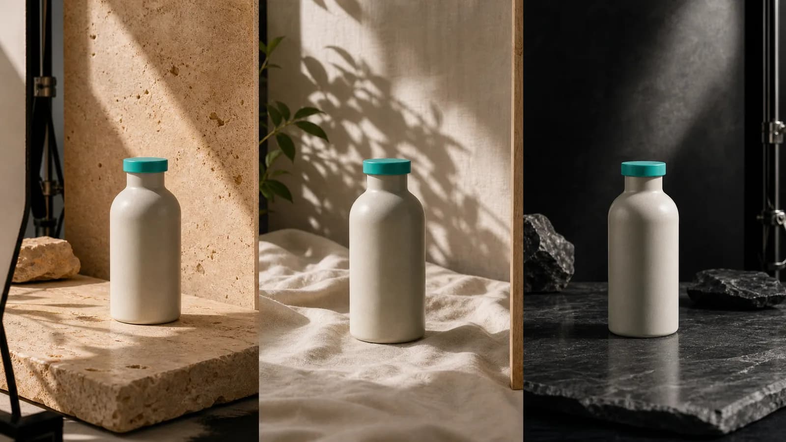
Every regeneration rolls the dice on everything at once. You ask for a warmer background and the bottle cap changes color, the shadow flips direction and the model invents a new label. After ten rounds you have ten different products and a feed that looks like it belongs to ten different shops.
Editing works the other way. You decide what is already right, protect it, and change one thing. That only works if the team agrees on what right means, which is why the first step is not a tool at all.
Write a brand visual spec first
A brand visual spec is a one-page document that a stranger could use to accept or reject an image. It should be specific enough to settle an argument. Four parts cover most small brands.
- Palette: three to five hex codes with roles (primary, accent, background, text on dark, text on light). Add a rule such as accent color covers no more than about a fifth of the frame.
- Type: one headline font and one body font, plus sizes for a square post and a vertical story. State where text may and may not sit.
- Logo rules: approved corner, clear-space margin, minimum size, and which version (full color, white, dark) goes on which background.
- Photo style: light direction, surfaces, props you use and props you never use, how much of the frame the product fills, and whether people appear.
Write the photo style as observable facts, not adjectives. Soft daylight from the left on cream linen is testable. Clean and premium is not. Attach three approved example images to the spec and three rejected ones, each with a one-line reason. New team members and freelancers learn the standard faster from those six pictures than from any paragraph of description.
If you would rather not maintain this by hand, a saved brand model can hold the palette, fonts, tone and logo so generation starts from them instead of from a blank prompt.
Anchor every generation to reference images
A text prompt describes a product. A reference image shows it. When the model can see your real bottle, your real logo lockup and one or two finished posts that you consider on-brand, it has far less room to improvise.
Choose references with a purpose. One image for the product's exact shape and label. One for the mood and lighting you want repeated. One for the logo. Avoid sending a stack of loosely related photos, which muddies the signal. Our overview of which image models suit which jobs notes that support for multiple references varies a lot between models, so check how many your tool accepts before you plan around it.
Fix problems with region and markup edits
When an image is ninety percent right, regenerating throws away the ninety. Region edits keep it. You mark the area that is wrong, write an instruction for that area only, and leave everything outside it alone.
What markup edits handle well
- Removing a stray object, extra hand or reflection.
- Correcting a color that drifted, such as a cap that turned green instead of teal.
- Replacing a background surface while keeping the product untouched.
- Softening one harsh shadow without relighting the whole scene.
Where they struggle
Large structural changes, like turning a front view into a side view, are better handled by regenerating with a new reference. Small edits can also leave a visible seam, so zoom to full size and check the edge of every edited region.
Keep text and graphics on separate layers
Any word that must be spelled correctly should be a layer, not part of the picture. Generated text is fine for a mood board and risky for a live ad. As a layer, the headline stays sharp, uses your exact font and hex codes, and can be changed without touching the image underneath.
The same logic applies to price badges, sale stickers and legal lines. Build the picture once, then add the layers per campaign. It also makes localization simple: one image, several text layers. Our article on multilingual content marketing goes further on that workflow.
Place the logo by rule, not by prompt
Asking a model to draw your logo is asking it to redraw it. Letterforms shift, the mark gets simplified and colors change by a shade. For a logo that must be exact, place the real file as an overlay at a fixed position and size, and tell the generation to leave that area clear.
The rule from the spec then becomes something you can check with a ruler: bottom right, margin equal to the height of the letter in the wordmark, white version on dark backgrounds. If a background is busy behind the logo, adjust the background or switch the logo version. Do not shrink the logo below the minimum size just to fit.
Worked example: fixing an off-brand batch
Petal and Pine is a fictional skincare shop with a cream ceramic bottle and a teal cap. The owner generated 24 product images for a spring campaign in one evening. Looking at the grid the next morning, she saw the problem: nine had a warm orange tint, five had a different cap color, three had an invented second logo on the label, and the rest were fine.
Regenerating all 24 would have restarted the lottery. Instead she sorted by defect and worked through them.
- She kept the 7 images that passed the spec untouched.
- For the 9 orange-tinted images, she used a region edit on the background surface only, asking for a neutral cream tone, and left the bottle alone. Six were fixed in one pass. Three still looked off and were regenerated with the on-brand lighting image as a reference.
- For the 5 wrong caps, she marked the cap and gave the hex code for the teal. Four came back correct.
- For the 3 with an invented label, she regenerated with the real label photo attached and then placed the actual logo file as an overlay in the approved corner.
- She added headline text as a layer in the brand font, so the campaign name matched across every image.
End result: 22 usable images from 24, with 4 regenerations and about 15 edits, and a grid that looked like one photo shoot. She then added a line to the spec about warm tints, so the next batch started with a rule for it. If you want to try the same flow, the AI image generator in SEENALYZE AI includes layers, markup edits and logo placement in the same editor.
When regenerating is the better call
Editing is not always cheaper. If more than about a third of a batch fails the same rule, the problem is upstream, in the prompt or the references, and patching each image is wasted effort. Fix the cause, then regenerate the whole set once.
Regenerate too when the composition itself is wrong: the product is cropped, the angle hides the label, or the scene contradicts the brand. Edits refine an image. They do not rescue a bad starting point. A quick rule of thumb is to allow two edit passes per image, and if it still fails after that, start over with a better reference and log what you changed in the spec.
A consistency checklist before you publish
Run every image through this list at full size, on a phone and on a desktop monitor. Reject on any failure and note which rule was broken, since repeated failures point to a gap in the spec.
- Color: sample the main brand color with a picker. It should be within a few points of the hex code, match it measurably.
- Logo: it is the real file, in the approved corner, at or above the minimum size, with the correct version for the background.
- Product: shape, label text and proportions match the reference photo. Compare side by side.
- Text: every character proofread, correct font, readable at thumbnail size.
- Light and surface: direction and temperature match the last five published posts.
- Edges: no seams, halos or smeared texture around edited regions.
- Grid check: place it beside the last nine posts. If it stands out, ask why before posting.
- Claims: the image does not show a result or effect the product cannot deliver.
Items 1 to 3 catch the failures customers notice most. Item 8 matters for your reputation and for platform ad policies, and it is covered further in our guide to AI-generated ads on Meta and Google.
Edit AI images to match your brand
Use layers, region edits and logo placement to turn near-misses into on-brand posts without starting over.